Oregon State Park System
Logo Set
Problem
Research and develop logos for three parks within a specific state park system in the United States, ensure they create a cohesive set.


Design a promotional poster for one of the parks drawing inspiration from the travel posters of the 1920s and 1930s. The poster should be crafted to effectively resonate with the target audience and entice them to visit the chosen park.
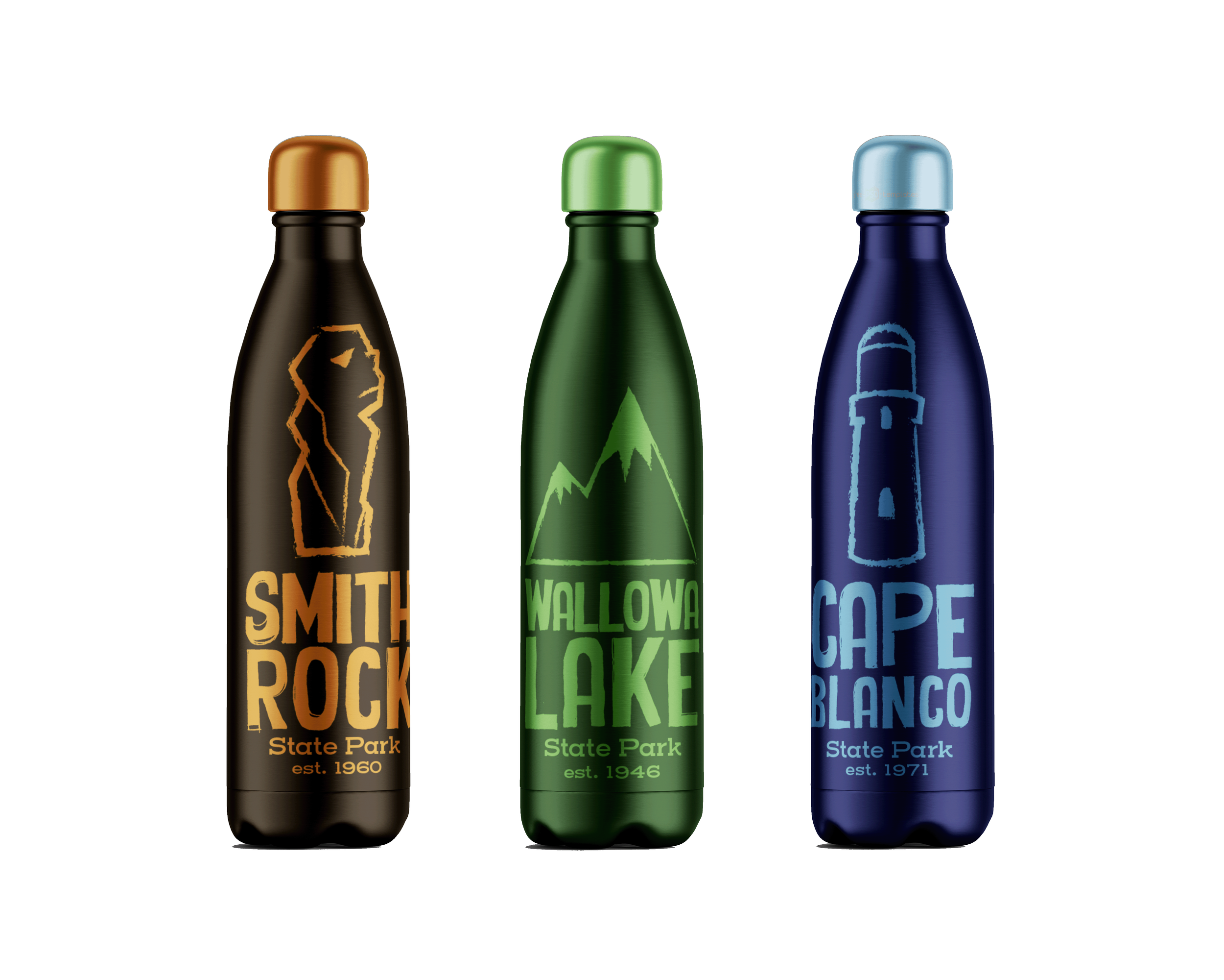
Solution
Illustration: Depicting a climber scaling “Monkey Face” effectively communicates one of the park's key attractions. Incorporating a figure in the foreground creates depth and guides the viewer's gaze throughout the poster.
Border and Layout: The use of a border to house the headline and park name at the top of the poster provides a structured layout that organizes information effectively.
Typography: The Dunbar font for the headline pays homage to Erbar-Grotesk, a font found frequently in 1920’s and 30’s European travel posters.

Poster
Problem
Solution
Minimal Design: The logos are clear and simple without unnecessary details, enhancing the logos' legibility and memorability.
Iconicity: The logos are easily recognizable symbols associated with their respective locations, enhancing brand identity.

