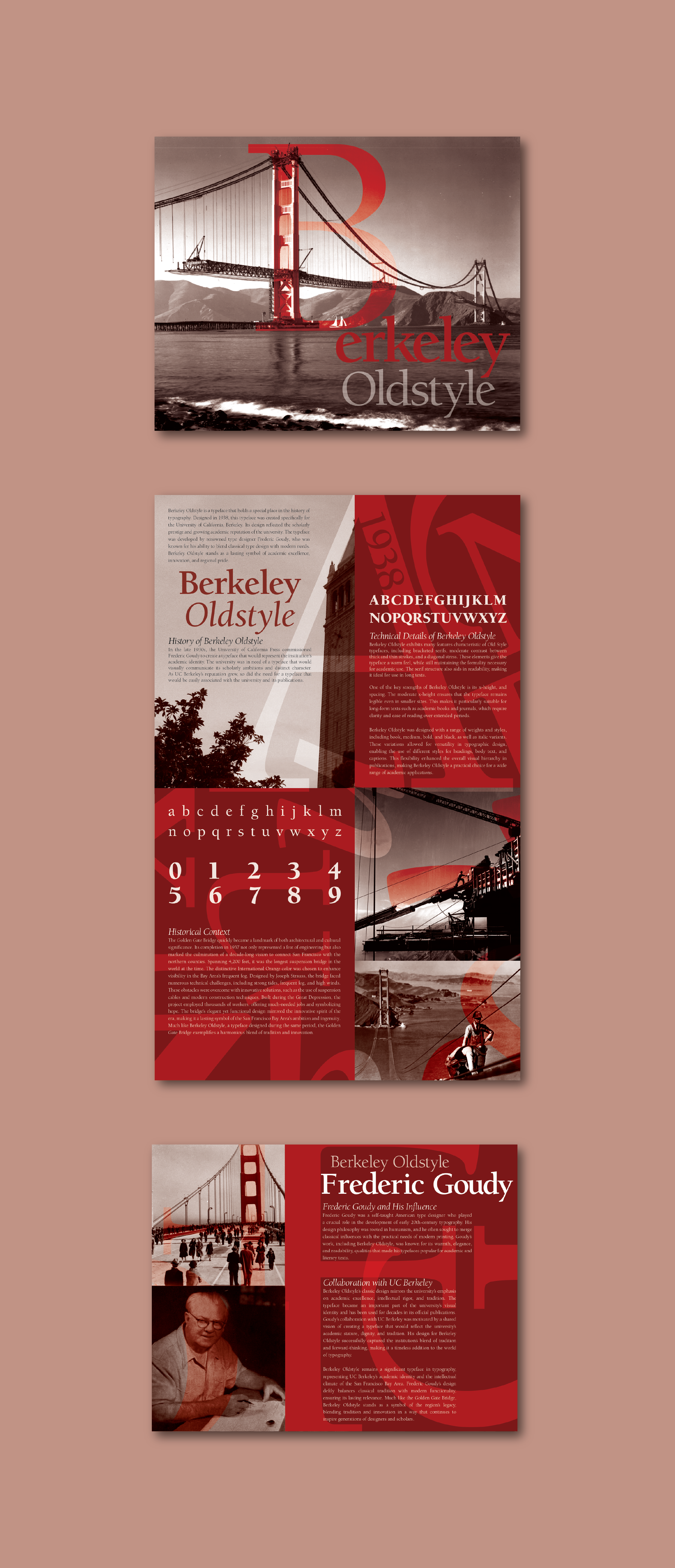
Berkeley Oldstyle Booklet
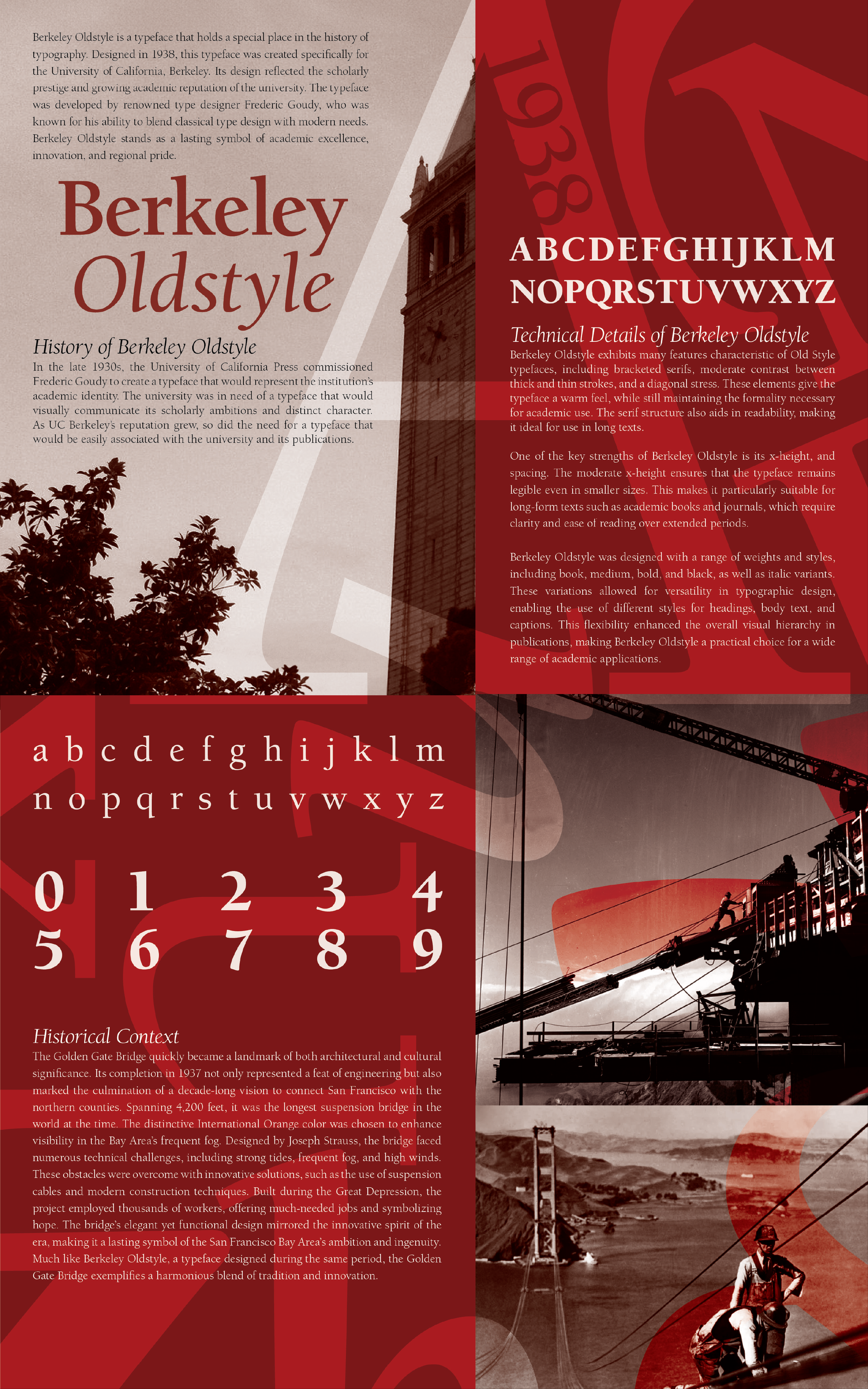
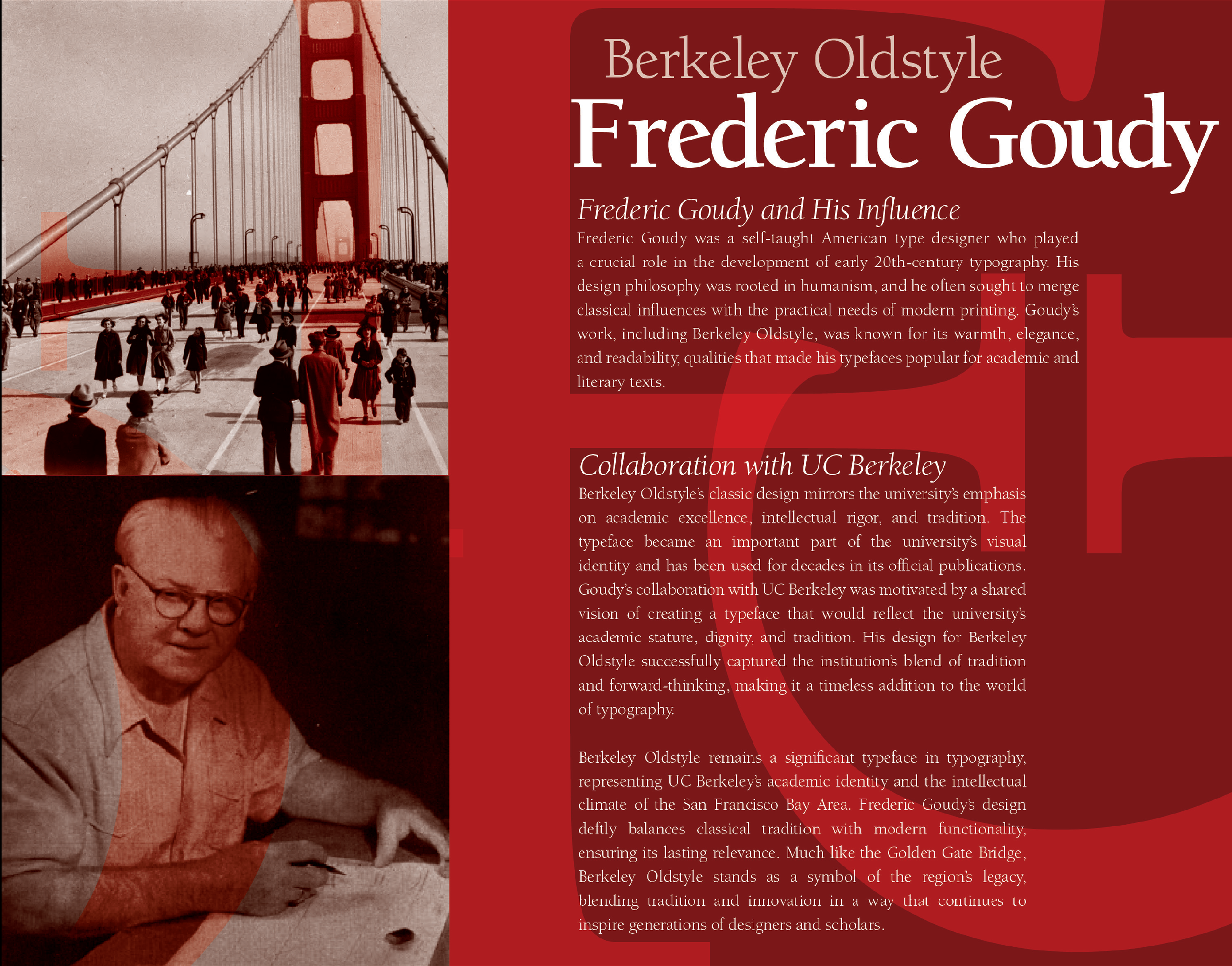
Inner Spread
Back
Problem
Design and produce a four-page typographic booklet that highlights the historical and design significance of Berkeley Oldstyle. The booklet must creatively express the typeface's name and history through typography and imagery, visually representing its era or characteristics.
Solution
Hierarchy: I used contrast between dynamic typography and structured body text. The pages balance expressive letterforms that guide the eye across the page, while maintaining a clear hierarchy through varying font sizes, weights, and spacing.
Typography: Careful attention was given to kerning, leading, and tracking to ensure readability. The body text was formatted to prevent rivers and excessive hyphenation, maintaining an elegant and structured presentation.
Color Theory & Historical Context: The red color scheme was chosen as a direct reference to the Golden Gate Bridge, reinforcing the connection between the typeface and its historical context. This use of color evokes strength, innovation, and legacy—key themes associated with both the bridge and Berkeley Oldstyle.
Flow: The letterforms of Berkeley Oldstyle were intentionally placed to create a visual flow that leads the viewer’s eye through the layout. While incorporating dynamic typographic elements, I ensured that the composition was not overwhelming. Negative space was carefully used to give the reader’s eye areas to rest.